Grand ClearMark Award Winner
Consumer Financial Protection Bureau
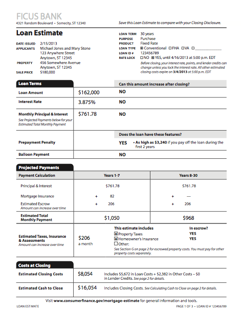
- Link: CFPB Loan Estimate Form
- Judges’ Comments: Anytime an agency turns two long, head-scratching forms into one that’s not only shorter, but more clear, we rejoice. CFPB has produced a form that people shopping for home loans can use to see their loan terms, projected payments and closing costs, so they can compare offers from different lenders. The testing that went into this redesign – both before and after – is impressive, and it shows in the results. Consumers understand and can use this form more easily, and lenders are actually eager to use it. That’s a big win for a public agency – and the public.
Original Documents
University of Rhode Island
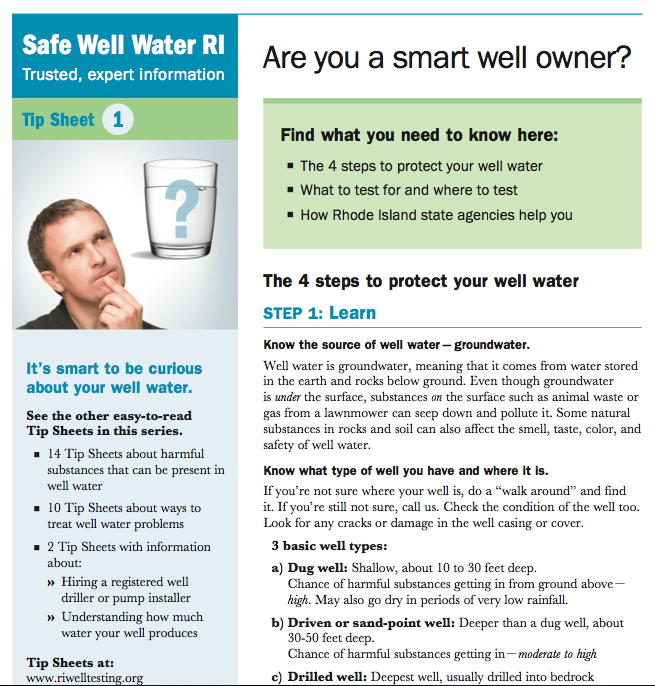
- Year: 2014
- Type: Original document
- Link: Are You A Smart Well Owner- Document
- Judges’ Comments: This short, informative brochure teaches well owners how to identify the type of well they own and how to protect it. It makes excellent and appropriate use of charts and pictures to support the words and is a great example of what a plain language document should be.
UnitedHealthcare Medicare & Retirement
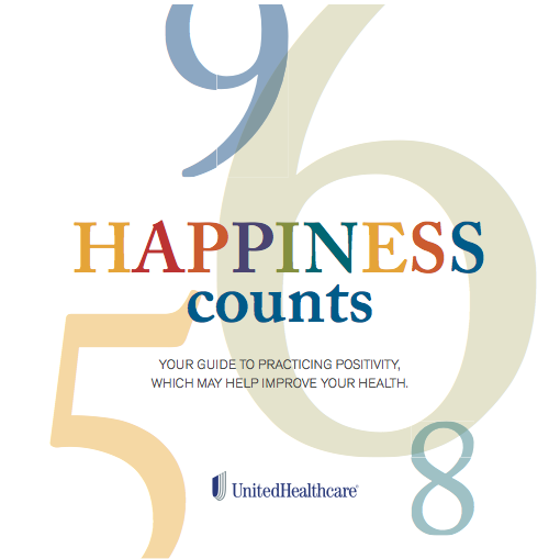
- Year: 2014
- Type: Original document
- Link: UnitedHealthcare Happiness Counts Kit
- Judges’ Comments:UnitedHealthcare’s Happiness Counts Kit is a beautifully designed invitation to recognize and create happiness in our lives. Plain language techniques – especially familiar words and friendly tone – make it easy for the reader to absorb and connect with the content. The overall structure, clever typography, and effective use of space make the messages clear and memorable. Well done on creating a simple, effective tool to benefit clients and bring valuable goodwill to the company.
AARP
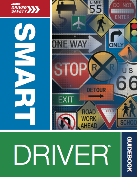
- Year: 2014
- Type: Original document
- Link: AARP Smart Driver Participant Guidebook
- Judges’ Comments: This driving course handbook is for drivers over 50, and the authors do a terrific job helping older drivers understand how age affects driving performance. The guide is colorful, and it uses graphics, fonts, and white space very well. The layout really enhances the usability of the guide. AARP has written and designed an informative and easy-to-use guide that customers can use both now and in the future.
Revised Documents
Consumer Financial Protection Bureau

- Year: 2014
- Link: CFPB Loan Estimate Form
- Judges’ Comments: Anytime an agency turns two long, head-scratching forms into one that’s not only shorter, but more clear, we rejoice. CFPB has produced a form that people shopping for home loans can use to see their loan terms, projected payments and closing costs, so they can compare offers from different lenders. The testing that went into this redesign – both before and after – is impressive, and it shows in the results. Consumers understand and can use this form more easily, and lenders are actually eager to use it. That’s a big win for a public agency – and the public.
Health Care Service Corporation
- Year: 2014
- Type: Revised document
- Link: Claims Letter
- Judges’ Comments: We’ve all received bureaucratic and impersonal letters from insurance companies, with that tiny computer-generated type that says, “no human hands have touched this.” The “before” version of this claims letter was just that. The revised letter uses a larger and better font, great use of white space, and formatting to highlight exactly what comes next to make the recipient feel like there are human beings on the other end who really care about his needs. The words are clear and personal. It shows that this company cares about great customer service.
AETNA
- Year: 2014
- Type: Revised document
- Link: Redesign of Aetna Medicare Advantage Enrollment Packet 2014
- Judges’ Comments:Sometimes, the answer is right there in front of you. Aetna embraced that idea and redesigned its enrollment kit around the 4 questions customers ask most: Is my doctor in your network? Will you cover my medicines? How much will it cost? And How do I enroll? By putting those answers right in front of their customers, they show they know what their audience wants, and they give it to them. The use of plain language techniques – including words and graphics – make this packet fun to read. Good job.
Legal
American Bankruptcy Institute
- Link: Law Review Document
- Judges’ Comments:(American Bankruptcy Institute Law Rev): Maybe you wouldn’t choose to read this law review article with your morning coffee, but if you were a bankruptcy lawyer or judge, you’d find it a pleasure to read. It’s a model use of plain language for discussion of a legal topic. Generally free of jargon, the article leads the reader through a complex subject using informative headings, topic sentences, and a good balance of long and short sentences–among other plain language techniques. The author’s conversational tone and obvious candor and fairness help to make this article an easy read.
Multimedia
Blue Cross Blue Shield of Massachusetts
- Link: Tutorial
- Judges’ Comments: This clever little cartoon does a great job explaining health savings accounts and high-deductible health plans in an entertaining way. Because it looks simple and the words are plain, it makes these complex and often confusing concepts seem simple. Well done.
Websites
Unum
- Link: Unum website
- Judges’ Comments: Unum is an employee benefits company, and its website is designed for three primary audiences — its employer clients, their employees and families, and insurance brokers and consultants. Its purpose is obvious from the home page, and it is well-organized, friendly, and easy to navigate. The website conveys important information in an economy of words. The tone is light and the graphics instructive and appealing throughout. As one reviewer commented, “I never thought I’d call an insurance company site compelling. But that’s just what Unum’s is.”
AARP
- Year: 2014
- Type: Website
- Link: AARP’s Health Law Answers website
- Judges’ Comments: AARP’s Health Law Answers (AARP): AARP has created a simple, easy-to-use step-by-step series of questions to generate a personal report summarizing how the health care law affects you. It’s easy to understand and easy to use because it’s lean and clean and personal. The report you get even links you back to help and resources in your own state. AARP knows its audience, and it shows.
Agency for Toxic Substances and Disease Registry
- Year: 2014
- Type: Website
- Link: Don’t mess with mercury site
- Judges’ Comments: “Don’t Mess With Mercury” targets middle school students and teachers, giving them information and tools to understand the problems with mercury and what they can do to make sure they’re safe. It’s interactive, it engages the reader, and it makes learning easier. Language, graphics, and organization make this site very usable. This website may be targeted to students and teachers, but it’s informative and fun for everyone.