The ClearMark awards recognize the best plain language communication written for consumers by private companies, public entities, and non-profits. 2015 competition categories include:
Grand ClearMark Winners
Grand ClearMark Award Winner – English
Suburban Hospital, a member of Johns Hopkins Medicine
– My Get Well Kit
Grand ClearMark Award Winner – Spanish
Federal Trade Commission – Cobradores de deuda
Category Winners and Finalists
Category: Original Documents
Private Companies
Winner: Health Care Service Corporation – Health Insurance Buyer’s Guide
Judges’ Comments:
“Many consumers who previously were confused about the new health insurance landscape should have some of their confusion cleared up after reading this guide. If I were in the market to purchase health insurance under the ACA, this guide would be a great start to help me figure out some basic questions.
Plain language and information design create an easy-to-follow guide for people searching for health care. This entry is an example of how to use graphics and charts in a written document to communicate information. In some cases, the bars, charts and/or symbols alone were enough for me to comprehend the information – I didn’t need the text. The brochure speaks directly to the reader, defines terms right up front, uses headings, lists, graphs, common words and active voice, with excellent use of steps to help guide someone through the process. It is a superbly designed and written document for a challenging topic.”
Finalists
- Beacon Health Options – Gender Dysphoria Content on Achieve Solutions
- UnitedHealthcare Medicare & Retirement – UnitedHealthcare 2015 Medicare Advantage Enrollment Guide
- Anthem, Inc. – Amerigroup GA Families 360 Member Newsletter
- IQ Solutions – CVD Risk Infographic
- Humana – Let’s get started | Your 2015 Member Guide
- UnitedHealthcare Medicare & Retirement, Insurance Solutions – Medicare at a Glance Selfmailer & Digital Education Piece
- Navient – Navient Transitional Communications
- IQ Solutions – Know Your Terms: Term Talk Poster
- Western & Southern Life – Possibilities Recruiting Booklet
Public
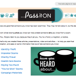
Winner: Federal Trade Commission – Bilingual Pass It On and Pásalo Campaign
Judges’ Comments:
“The FTC has created not just “a brochure”, or “a website,” but a complete, consistent campaign. Every part – the website, the brochures, the video, the bookmarks – are considered on their own, as well as part of the campaign to encourage older people to “talk and share” about potential fraud. This campaign does not portray people over the age of 65 as frail, poor, silly, digitally illiterate, prone to crime, etc. Very much the opposite. In every detail, the campaign does not “talk about elderly people,” but “empowers them to involve and help others.” This is a great change in perspective.
The writing is fantastic. The conversational tone is helpful and honest, yet authoritative. It focuses on clear steps that readers can take to deal with each concept/situation it discusses. The entry succeeds in taking a potentially embarrassing topic (being taken by a scam) and turns it into an engaging, informative, respectful discussion with the reader. If a governmental institute is able to develop a campaign of this quality and consistency, approaching a difficult issue from the perspective of the people who are most at risk by empowering and enabling them to take action, it is top-class.”
Finalists
- Centers for Disease Control and Prevention – CDC Check and Report Ebola (CARE) Kit Material
- Centers for Disease Control and Prevention – Is It Flu or Ebola
Non-profits
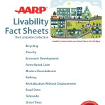
Winner: AARP Livable Communities WALC Institute – AARP Livability Fact Sheets
Judges’ Comments:
“This entry is well-organized, useful and accessible. The fact sheet is designed to help city officials and civic-minded citizens understand the concepts involved in creating Livable Communities. It does a beautiful job of framing a complex — and potentially very dull — topic so that it connects with issues the audience knows and cares about.
It isn’t easy to spin a pile of facts and statistics into a clear, flowing, and persuasive narrative, but this piece makes it seem entirely natural. The result is that we focus on the content, not the writing, design or structure. Now THAT’s plain language.
Simple, strong design, clear navigation, carefully worked out hierarchies, great use of visual cues – the information is the hero as it should be. The “Myth-Busting!” sections are both fun and truly informative. This piece gracefully and calmly manages to get an amazing amount of work done and to cross an amazing distance, delivering information right to users in a way they can relate to it. One of the best pieces I’ve seen in a long time.”
Finalist
- AARP – The ABCs of 401(k)s
Category: Revised Documents
Private Companies
Winner: Anthem Medicare Marketing – Medicare Advantage House Call Program Campaign Brochure
Judges’ Comments:
“This brochure should help Medicare Advantage members learn how to take advantage of the house call program and understand what the benefits entail. It does an excellent job of calling out the two main questions that a member would have: “How does the program work?” and “How do you benefit?” As a reader, I instantly understand what to expect from the brochure and where to find the most key information. The team did an outstanding job understanding that they needed to streamline the information to appeal to Medicare beneficiaries and help them recognize that they qualified for a free service.
The improvements from the original to the revised version are miraculous. The original was so dense that it was completely uninviting. I can’t imagine that any beneficiary tried to read it. The revised version is clean, bright, easy to follow, and has a clear message.
The improvements from the original to the revised version are so dramatic and positive that this entry deserves a “wow. Given the challenges of getting government clearance of such a different approach and working with so many vendors, the team deserves a standing ovation.”
Finalists
- Chase – Here is your new debit card – use it to protect your account
- Anthem, Inc. – Medicare Advantage 2015 Welcome Kit: Improving the New Member Experience
- Bank of America – Merrill Edge – Investing in Mutual Funds refresh
Public
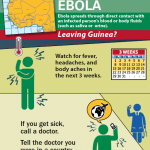
Winner: Center for Disease Control and Prevention – Health Advisory: Ebola
Judges’ Comments:
“This card-sized notice advising international travelers from Africa about the symptoms of Ebola creates a context for the reader and is then instructional. The purpose and actions are very clear, and the writing, tone, and presentation are very appropriate to the needs of the traveling public. Even a tired, stressed traveler is likely to see, understand, and act on this notice.
The bright card is a great simple solution with effective graphics to complement the copy. The copy is short and to the point. The “after” notice successfully includes only the most relevant content from the “before” and does so using clear, audience-friendly language that is easy for the target audience to understand.
The “after” version of this notice is an excellent example of a plain language transformation that satisfies the very real needs of both the organization and the reader.”
Finalists
- Social Security Administration – Disability Campaign Social Media Instructions
- U.S. Citizenship and Immigration Services (USCIS), Department of Homeland Security – Form I-600A Approval Notice
- CDC – Vessel Sanitation Program: Keeping You Healthy on the High Seas
Non-profits
Winner: Suburban Hospital, a member of Johns Hopkins Medicine
– My Get Well Kit
Judges’ Comments:
“Wow! This revision of the traditional patient handbook with the interactive “My Health Care Notebook” and the separately bound “Patient Handbook” is outstanding from concept to execution. Suburban Hospital found a way to communicate vital information in a creative, patient-friendly way that makes an otherwise anxious situation more comfortable for both patients and caregivers. From entering the hospital to discharge and beyond, the easy-to-follow steps guide the patient through the process. The “Notebook” also provides an important way to collect and retain vital medical information and directives that might be misunderstood or lost.
Structure is where this entry stands out. Thought has gone into what is important to the patient – what they really need to know – and what is not. A range of structural devices make the content usable, from the high-level splitting of content into the folder and handbook, down to the flow within each document. The writing is purposeful – it’s there to help patients manage their own care.
My Get Well Kit is a huge improvement on its predecessor. With this entry you really do get the sense that the hospital is there to meet the patients’ needs and to make their lives easier.”
Finalists
- AARP Livable Communities – AARP.org/livable
- Blue Cross Blue Shield of Michigan – Helping Consumers Understand Healthcare
Category: Websites
Private Companies
Winner: Aetna Inc. – Aetna’s Consumer Tumblr Blog
Judges’ Comments:
“The Consumer Tumblr Blog gives a human face to the organization. It provides practical tips on how to make the most of Aetna’s products and also gives “life” tips, even with employees sharing recipes. It clearly supports a community and provides relevant information in a fun, easy-to-read format.
The authors present reader-focused content in an eye-catching way. An interesting platform, the blog works well for the type of content/information being conveyed. It uses cards to present interesting tidbits of info that might entice someone to click and learn more. It also presents educational content in a friendly manner, with the conversational snippets written in plain language. In short, the blog presents engaging, task-oriented bites that direct users to information.”
Finalists
- Sun Life Financial – SunLifeKnowsBenefits.com
Public
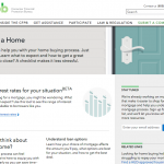
Winner: Consumer Financial Protection Bureau – Owning a Home
Judges’ Comments:
“This CFPB site section is exceptional primarily because of the daunting complexity of the subject they are tackling and the severity of repercussions when first-time home buyers make a mistake. The research done before starting the project is reflected in the breadth, depth and clarity of the final pages. So much information needs to be conveyed, but the authors keep most explanations, especially those on mortgage paperwork, to one page per document.
Information design is where this entry shines. For example, the Closing section gives step-by-step instructions about what to do before, during and after closing. They separate the tasks and give people a single PLACE to put the information they are urged to get and use. This crucial part of good information design turns what could be a daunting to-do list into a useful tool.
Testing, both qualitative and quantitative, seems to have been done early and often for this section of the CFPB site. It informed the content selection, titling, copy, etc. This is, ideally, how testing should be used to improve comprehensibility of communications.
This example of best practices for plain language and communication graphics cuts voluminous and complex content down to a palatable size for consumers. Kudos to the CFPB for this outstanding work.”
Finalists
- Social Security Administration – SOCIAL SECURITY ADMINISTRATION’S FREQUENTLY ASKED QUESTIONS WEBSITE
- Transportation Security Administration – The TSA Web Site
- Centers for Disease Control and Prevention, Office of Smoking and Health – Tips From Former Smokers Web Site (CDC.gov/tips)
- Transportation Security Administration – The TSA Mobile App
Non-profits
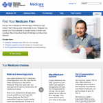
Winner: Blue Cross Blue Shield of Michigan – Blue Cross Blue Shield of Michigan Medicare Website
Judges’ Comments:
“This is a successful attempt to present complex information in an understandable way for all but the least literate citizens. Thanks to its simple (but effective) design and to the use of plain language, most visitors to the site will come away considerably better informed about Medicare and the plans available.
The information design is simple and consistent, allowing the reader to make easy comparisons. The data layout is also consistent so the eye can follow similar items with minimal obstruction in concentration.
As a non-American who knew nothing at all about Medicare, I was very pleasantly surprised with the friendly and helpful tone of the site and with the way it explains complicated concepts in relatively simple terms. Right from the beginning, you are reassured that you are in good hands and have nothing to worry about—everything will be explained.
This document is well thought through in design, information, and reader interest. Readers should be able to follow, interpret, and use the information presented with confidence and calmness, which should lead to organizational satisfaction in achieving established goals.”
Finalists
- AARP Livable Communities – AARP.org/livable
- Highmark Inc. – Highmark Blog – A Community for Healthy Ideas
Category: Multimedia
Private Companies
Winner: Anthem Medicare Marketing – The Basics of Medicare: Self-guided e-Tutorial
Judges’ Comments:
“This self-guided video is a superb example of plain language and great information design. It clearly is helping individuals learn about Medicare in an interesting way. With compelling visual elements such as the passport and “Medicare vacation” that the user takes, the information engages the viewer to follow. Also, the interactive multiple choices allow the user to play along with the topic!
The tutorial does an excellent job of interspersing slides with words and slides with pictures. The storyline of the vacation, putting the various parts of Medicare as if they were stamps in a passport, makes the tutorial vibrant and interesting. The information is presented in a balanced way; although they are selling Medicare Advantage, the tutorial comes across as a very clear explanation of the options and not as overselling. The speaker has just the right tone — slow, measured, carefully enunciated, friendly, responsive, conversational.
Users would get a lot of important information from this video. I learned a great deal myself! I appreciate the organization’s work in taking a complex topic and making it interesting and interactive.”
Finalists
- Emmi Solutions – Breast Cancer Decision Aid – Emmi® Program
- UnitedHealthcare Medicare & Retirement, Insurance Solutions – 4Q AARPMedicareSupplement.com Release & Defining Your Costs Educational Video
Public and Non-profits
Winner: Highmark Inc. – Consent Decree in Plain Language
Judges’ Comments:
“This entry is an excellent case study in crisis communication that succeeded. The situation was a perfect storm of the mandated change of dropping a major healthcare system from provider coverage, timed to hit healthcare open season, with potentially negative ramifications for all parties. The fact that Highmark exceeded member retention estimates indicates that the entry met its goals.
With no wrong note anywhere, the multiple delivery pieces acknowledge the seriousness of the situation while providing clear explanations and choices. There was no finger-pointing or “enemy.” Members don’t care whose fault it is; they just want help. The pieces also make the response personal, not bureaucratic. All pieces are geared toward moving the audience from confusion and anxiety to timely action.
The pieces are genuine. They took complex, legal language and made it about the end-user in a way that is sincere yet simple. I work in health care and know how difficult it can be to turn legal language and jargon into consumer-friendly terms – and have it approved by lines of business and legal all within short timeframes.
These pieces clearly benefit the end users — they help to educate in a system that is very complex, yet necessary for everyone to participate in. Great work!”
Finalists
- CDC Air Pollution & Respiratory Health Communication Team – Know How to Use Your Asthma Inhaler
- Health Literacy Missouri – Cover Missouri Health Insurance Literacy Campaign
Category: Legal Documents
Winner: Victoria Law Foundation – Everyday-Law.org.au
Judges’ Comments:
“The Entry is a web site that describes basic legal principles for everyday issues that apply in the Australian state of Victoria. It is an excellent presentation throughout. The Entry takes legal information that’s often hard to understand and puts it into everyday English.
The sections of the Entry are clearly organized and labeled. Everything is in common, everyday English. The headings clearly say what the reader gets when the heading is clicked. Lots and lots of links to other sites allow the reader to get more information on a topic. The grouping of topics and the language used on navigation buttons gives the sense that readers would readily find what they were looking for. This aspect of the site is most impressive.
The Entry uses the right conversational tone to reach its target audience, Victorians between 18-65 years of age who are in a wide range of economic situations. It seems to strike the right balance between talking over the heads of its audience and being too condescending. It’s generally free of legalese. Clearly, a lot of work went into development of the Entry, and the authors genuinely want their audience to be able to use this information.”
Finalist
- United States District Court, Northern District of Indiana – “Local Rules of the United States District Court for the Northern District of Indiana”
Category: Spanish
Finalists
- IQ Solutions – El embarazo: Conozca los términos
- Health Care Service Corporation – Customer of the future member flier



 Entries:
