
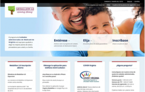
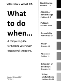
Virginia Medicaid Managed Care (Medallion 4.0) website, MAXIMUS Center for Health Literacy
Hydroxyurea for Sickle Cell Disease, CommunicateHealth

Judges’ comments
“This is a well-thought effort that gets better each time you read through it … Complex medical concepts are translated into everyday language that users will be able to understand. I absolutely would use this booklet as a prime example of plain-language writing and design.”
Finalists
- Consumer Financial Protection Bureau
- CommunicateHealth
- Institute for Healthcare Advancement
- Start Smart Foundations
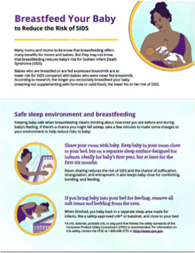
Breastfeed Your Baby to Reduce the Risk of SIDS Handout, Palladian Partners, Inc.
 Judges’ comments:
“This simply designed brochure will help reinforce important safety messages about breastfeeding helping to reduce the risk of SIDS … Very helpful integration of tips to give direction on what to do in challenging or risky situations. Well done!”
Finalists
- Anthem (2 finalist submissions)
- Institute of Design at Illinois Institute of Technology along with University of Chicago Medicine,
- Palladian Partners, Inc.
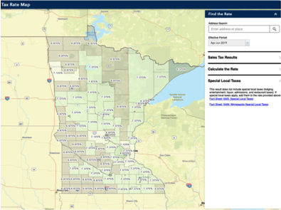
Minnesota Sales Tax Rate Interactive Map, Minnesota Department of Revenue
 Judges’ comments
“ Gaining insight from a survey and web-data analysis, the developers cut directly to a clear, effective solution for the audience’s specific need – a map. Without distracting add-ons, the map is incredible easy to navigate, and its layout lets you not only find tax rates for a specific area but also compare them across the state.”
Finalists:
- Consumer Financial Protection Bureau (CFPB)
- MAXIMUS Center for Health Literacy
- Minnesota Department of Revenue
- Plainly Speaking with Export Development Canada
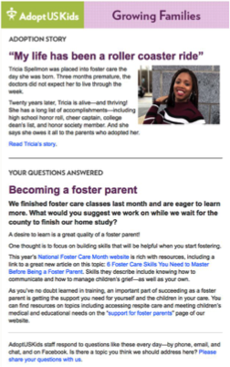
Category winner: Growing Families Together, AdoptUSKids
 Judges’ comments:
“This entry demonstrates plain language writing and information design very well, especially considering some of the particular government standards and policies which the organization must follow in its communications … The results suggest that the audience analysis, testing, and frequent revisions have paid off in improved engagement.”
Finalists
- AdoptUSKids
- Sallie Mae
- Anthem
- The Standard
Together by St. Jude, St. Jude Children’s Research Hospital
 Judges’ comments
“The website makes a topic as difficult and emotional as Cancer approachable and clear. The team clearly understands that cancer is more than medical jargon, so they address personal struggles as well as hospital ones. And they genuinely want their audiences to understand what’s written.”
Finalists:
- St. Jude Children’s Research Hospital
- Centers for Disease Control and Prevention
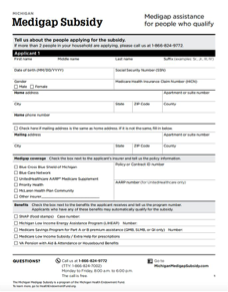
Michigan Medigap Subsidy Program Application, MAXIMUS Center for Health Literacy
 Judges’ comments:
“This subsidy application works hard to reach an audience that may struggle with financial forms because of low literacy, low numeracy, or a combination of both. Thanks to effective graphic design, the application helps users see exactly what they need to provide, taking the guesswork away from the consumer.”
Finalists:
- Anthem
- MAXIMUS Center for Health Literacy
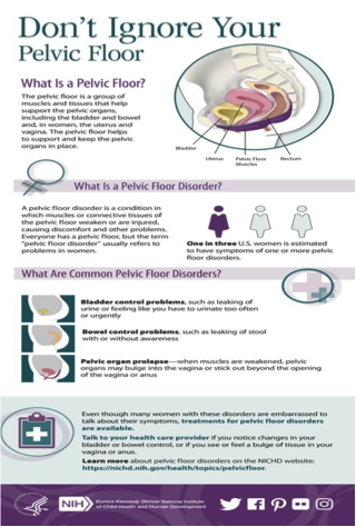
Don’t Ignore Your Pelvic Floor Infographic, Palladian Partners
 Judges’ comments:
“This infographic will enable women to recognize whether or not they have a pelvic floor disorder and know that they can talk to their doctor about treatment options … Headings and bold text guide readers through each section, while typography, color, and whitespace enhance the readability. This piece works on so many levels.”
Finalists
- Aetna
- Palladian Partners, Inc.
- National Institute for Occupational Safety and Health (NIOSH) with National Highway Traffic Safety Administration (NHTSA) Office of EMS
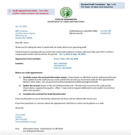
Making state audits readable, Washington State Department of Labor and Industries
 Judges’ comments
“This is an extraordinary entry no matter which category held it. Even without the before examples, the revised versions are spectacularly successful. I’ve never seen judges agree so thoroughly in their scores and comments. It’s an outstanding piece of work in all elements, including evaluation and the impact on its organization.”
Finalists
- Anthem
- Washington State Department of Labor and Industries
- Massachusetts Health Connector
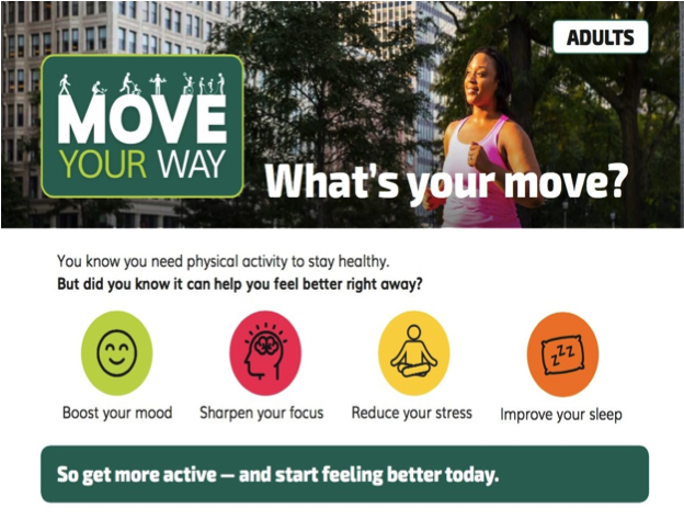
“Move Your Way” Fact Sheets, CommunicateHealth
 Judges’ comments
“After viewing this entry, it’s hard to stay still. Its visuals enliven the spirit, and its clear messaging gives a concrete sense of physical activity’s importance to the body, mind, and soul … The result is a model of plain language in its language choices and signposting, crisp writing, and visuals that connect with the eye and mind.”
Finalists
- Plainly Speaking along with Crime Prevention Ottawa
- Magellan Health
- CommunicateHealth
- Anthem
Virginia Medicaid Managed Care (Medallion 4.0) website, MAXIMUS Center for Health Literacy
 Judges’ comments:
“The design invites the audience to keep reading, and you can spot the important information at a glance. What’s more, the smart consumer testing validated the choices made for the web site, while uncovering areas for improvement. Overall, a solid example of plain language principles, and it should translate to higher enrollment rates and better informed consumers.”
Finalists:
- MAXIMUS Center for Health Literacy
- Cancer Support Community
- CommunicateHealth