The Center for Plain Language is proud to recognize the winners of the 2026 ClearMark Awards, presented in partnership with the Institute for Healthcare Advancement (IHA) as part of the Health Literacy Conference.
Each year, the ClearMark Awards honor work that helps people find, understand, and use important information.
This year’s winners show what clear communication looks like in practice. Across sectors and formats, they demonstrate how plain language improves understanding and helps people take action.
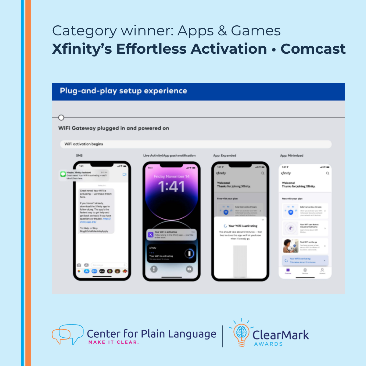
Category: Apps & Games
Winner: Xfinity’s Effortless Activation • Comcast
Why it stands out (judges’ comments)
“The reported user testing is a notable strength, with findings directly impacting real changes to the content based on user feedback. The entry’s impacts are quantifiable as well. Good work!
It is clear this entry did extensive formative research to understand their audience’s experience and where improvements were needed. The content looks simple and clear.
Excellent formative research and usability testing that informed iterations of the content. It’s clear that the customer was put first and consulted often!
The content addresses the reader directly, almost as if the technician were right there, and uses a friendly, conversational tone.”
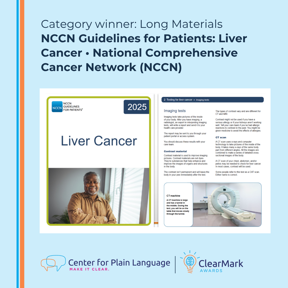
Category: Long Materials
Winner: NCCN Guidelines for Patients: Liver Cancer • National Comprehensive Cancer Network (NCCN)
Why it stands out (judges’ comments)
“The guidebook includes everything that patients/caregivers might want to know, whether they are at the beginning of their cancer journey or at the end.
This is a very helpful book. It is very detailed and that is exactly what patients need: it takes away many of the fears and remains positive.
The guidebook is presented in a tone that is respectful of patients and the seriousness of the condition, and also provides potential options, and hope.
As a former science writer who now works in health literacy, I think this is a gold star example of breaking down complex information in a digestible and considerate manner.”
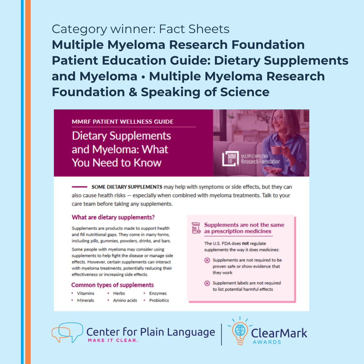
Category: Fact Sheets
Winner: Multiple Myeloma Research Foundation Patient Education Guide: Dietary Supplements and Myeloma • Multiple Myeloma Research Foundation & Speaking of Science
Why it stands out (judges’ comments)
“Very understandable – well done! Additionally, strong use of images/icons to support the information and not distract.
The flow builds from basics to more detailed risks and action steps. Clear, descriptive headings make it easy for patients and caregivers to scan. A particular strong point is the one-sentence “quick takeaway” at the top for ultra-fast scans by caregivers in crisis.
This guide excels in understandability: familiar words avoid jargon; short active sentences clarify actions simply.”
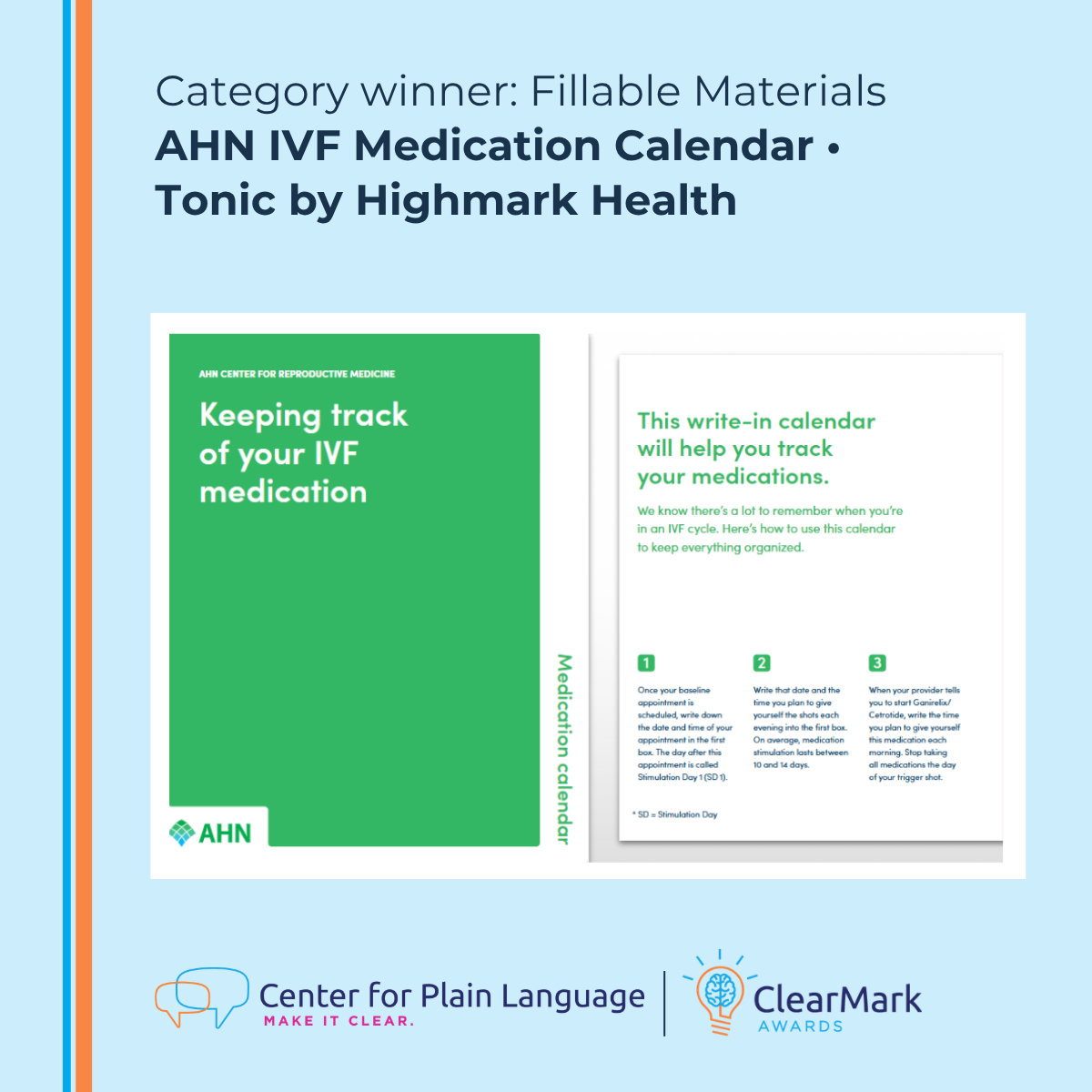
Category: Fillable Materials
Winner: AHN IVF Medication Calendar • Tonic by Highmark Health
Why it stands out (judges’ comments)
“This entry works because it is so tightly targeted to its singular job. A masterclass in focused simplicity.
This looks like an amazing tool, and it’s great that the fertility specialists and nurses helped you develop it.
Because of the pared-back content, it’s easy for readers to find what they need.”
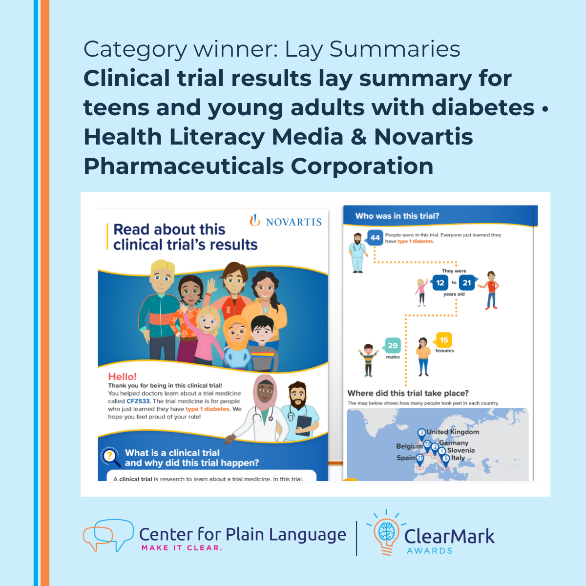
Category: Lay Summaries
Winner: Clinical trial results lay summary for teens and young adults with diabetes • Health Literacy Media & Novartis Pharmaceuticals Corporation
Why it stands out (judges’ comments)
“This is a great example of plain language. The sentences are short and have common words. The tone makes it clear that you are speaking to young people. It puts it in their words without being condescending.
I’m so impressed with the evaluation efforts on this entry! Wow. Great job regularly testing the content with your target audience and updating it accordingly.
This is such a superb resource with very clear and useful information.”

Category: Outreach Communications
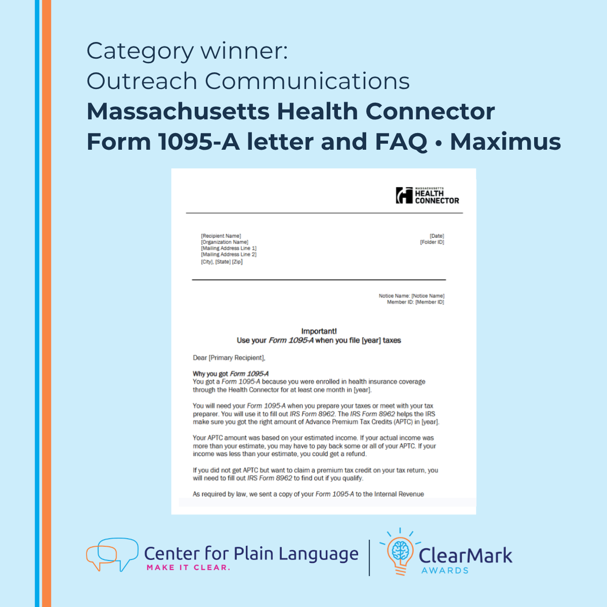
Winner: Massachusetts Health Connector Form 1095-A letter and FAQ • Maximus
Why it stands out (judges’ comments)
“The writing is strongly reader‑focused. It shows empathy for its audience and recognizes that people may have different levels of education and health literacy.
This entry uses clear, meaningful headings arranged in a logical order, making it easy for readers to find the information they need. By immediately explaining the purpose of the communication and what readers are expected to do, it sets people up for success from the start.
The checklist is helpful and anticipates questions. Very nicely done!”
Category: Posters, Flyers, Infographics
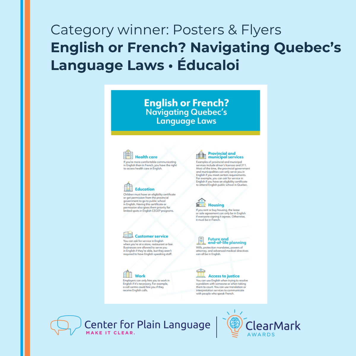
Winner: English or French? Navigating Quebec’s Language Laws • Éducaloi
Why it stands out (judges’ comments)
“This example does a great job of addressing a lot of information in bite-size yet meaningful ways.
Excellent job incorporating feedback from your audience and sharing how that impacted the project! The changes you made were so thoughtful and audience-centered – powerful to hear your examples of what you changed based on the feedback. Keep up the great work!
Putting myself in the shoes of someone who needs this information, I feel supported and clear about what to do.”
Category: Websites
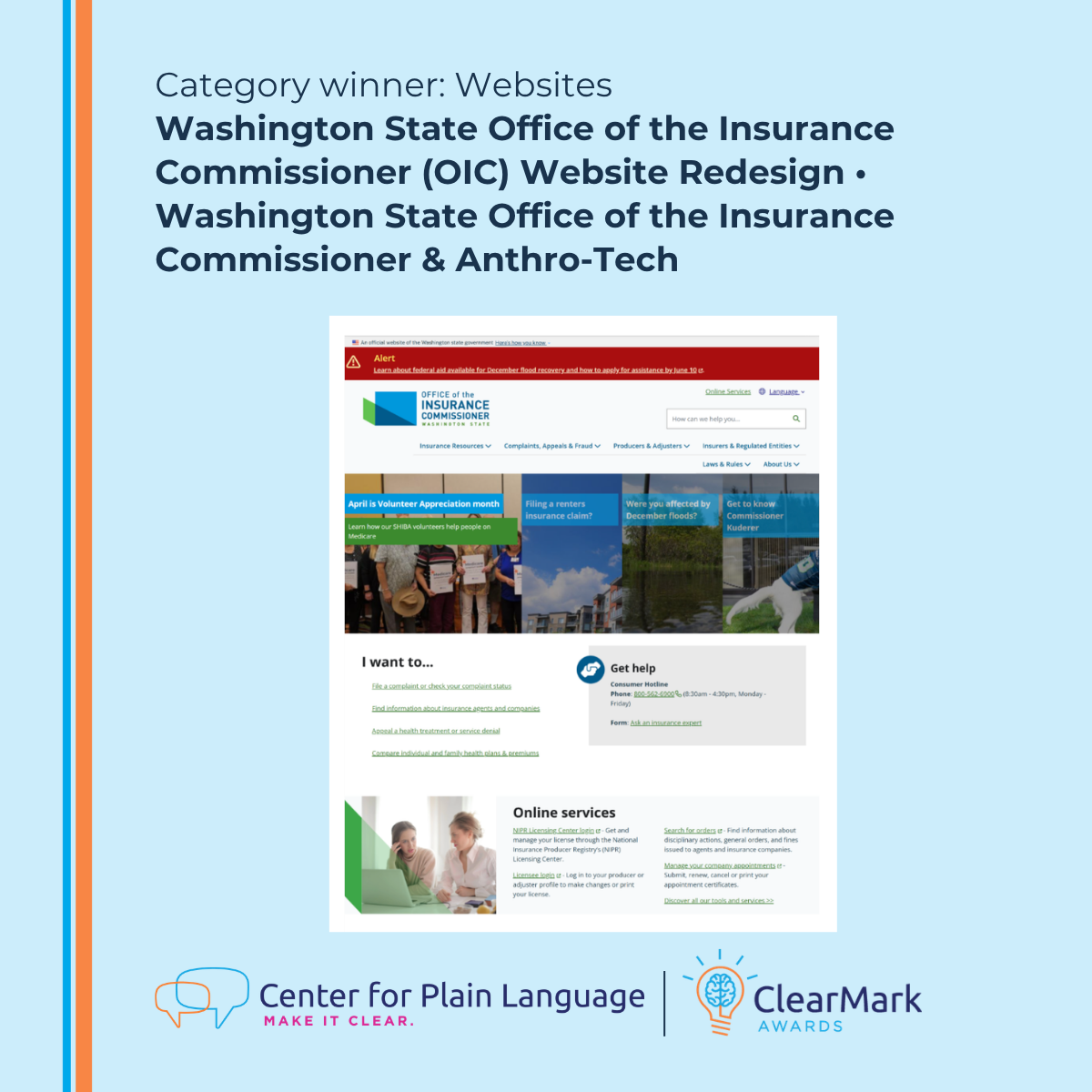
Winner: Washington State Office of the Insurance Commissioner (OIC) Website Redesign • Washington State Office of the Insurance Commissioner & Anthro-Tech
Why it stands out (judges’ comments)
“This site is a wonderful example of what thoughtful writing and design can bring to complicated subjects. It is clear that the creators spent time planning for, developing, and testing this site and felt a responsibility to serve their audience(s) with care.
The site’s positive impact is clear and it is not a surprise this work has been so successful. A genuinely great effort in a really important subject area!
Wow, excellent job identifying the audience groups and designing the site to serve these diverse audiences!
What a thorough approach to usability testing! This is the gold standard for all future submissions to strive towards.”
Category: French
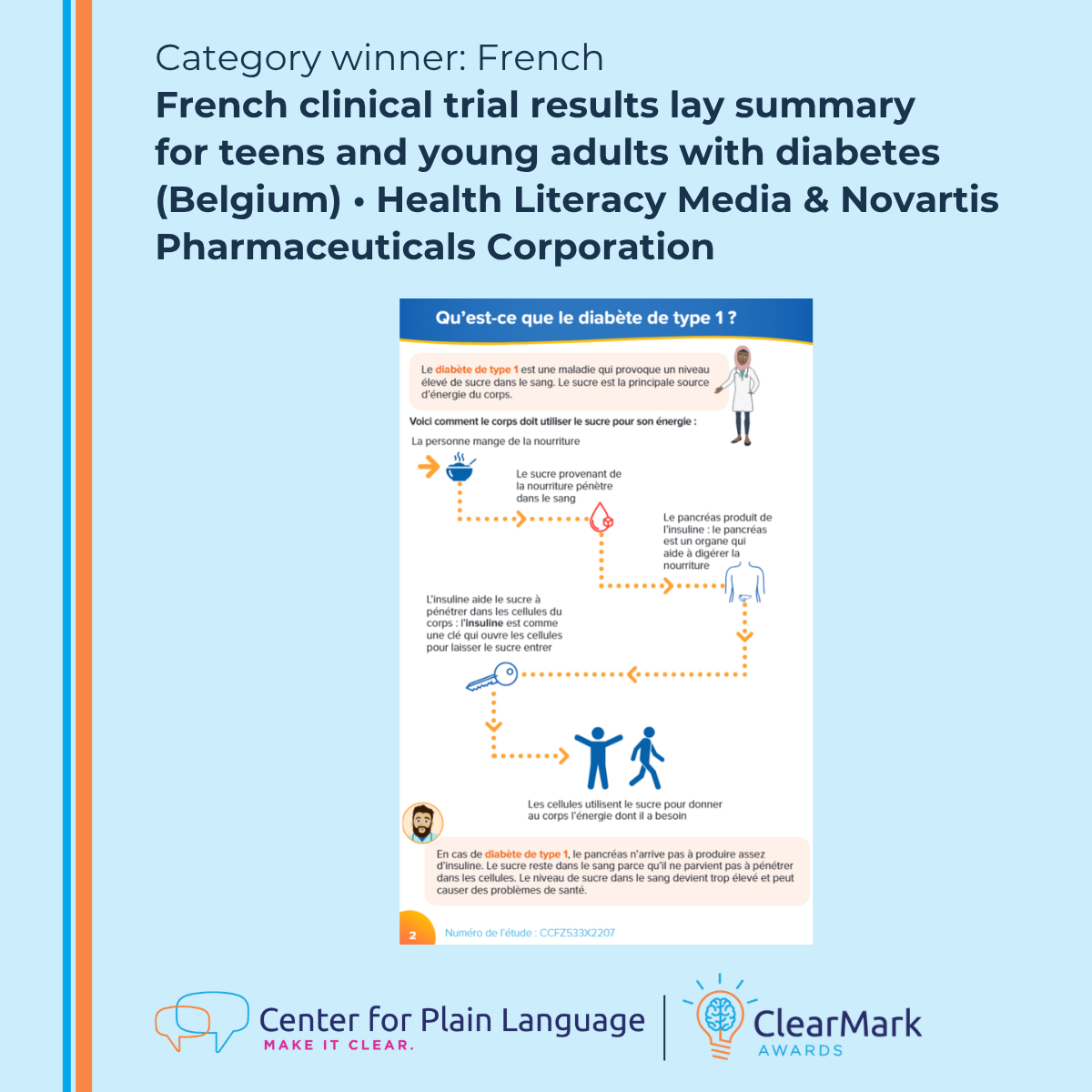
Winner: French clinical trial results lay summary for teens and young adults with diabetes (Belgium) • Health Literacy Media & Novartis Pharmaceuticals Corporation
Why it stands out (judges’ comments)
“The organisation and layout are clear, logical and accessible. The reader is not overwhelmed by too much information – this is a good example of careful editing.
The language and tone are appropriate for the intended audience. The visuals are well thought out and they actually perform work that helps the reader understand the overall message. The flow diagram explaining how sugar is processed is a very good example of effective communication.”
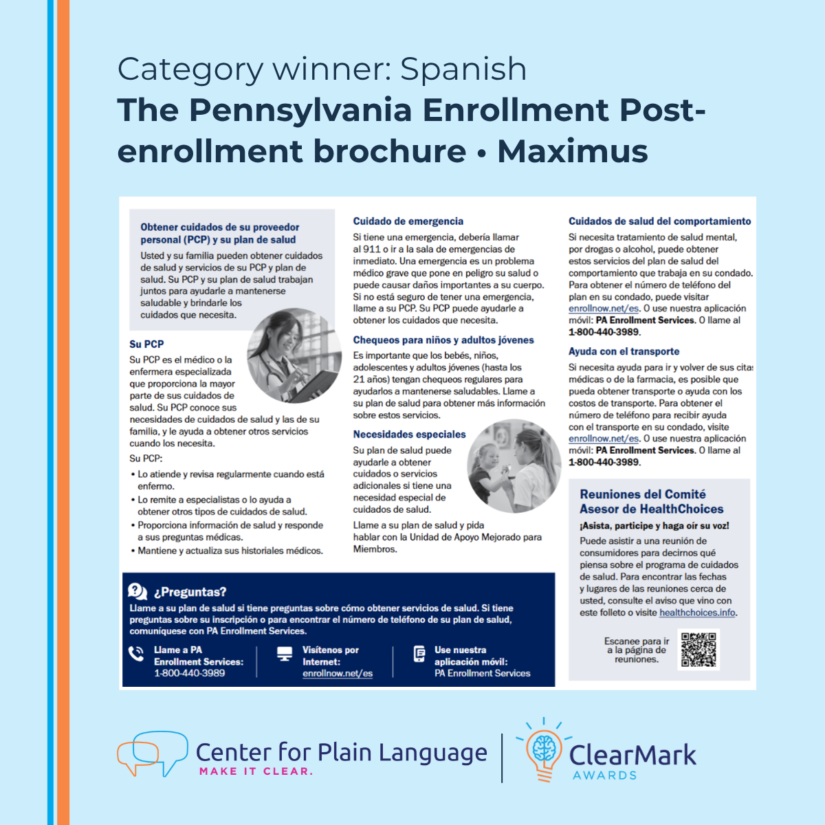
Category: Spanish
Winner: Pennsylvania Enrollment Services Post-enrollment brochure • Maximus
Why it stands out (judges’ comments)
“The brochure does a great job of presenting information for the general public in an easy, digestible way. It uses plain language principles effectively, and the format and layout are strong examples of clear communication.
The brochure uses everyday words and short sentences. This makes it easy for readers to find and understand the information.”
Grand ClearMark Winner
Winner: Clinical trial results lay summary for teens and young adults with diabetes • Health Literacy Media & Novartis Pharmaceuticals Corporation
Why it stands out (judges’ comments)
“This is a great example of plain language. The sentences are short and have common words. The tone makes it clear that you are speaking to young people. It puts it in their words without being condescending.
I’m so impressed with the evaluation efforts on this entry! Wow. Great job regularly testing the content with your target audience and updating it accordingly.
This is such a superb resource with very clear and useful information.”
Best In Awards
In addition to category winners, the ClearMark judges recognize standout work in specific areas of plain language.
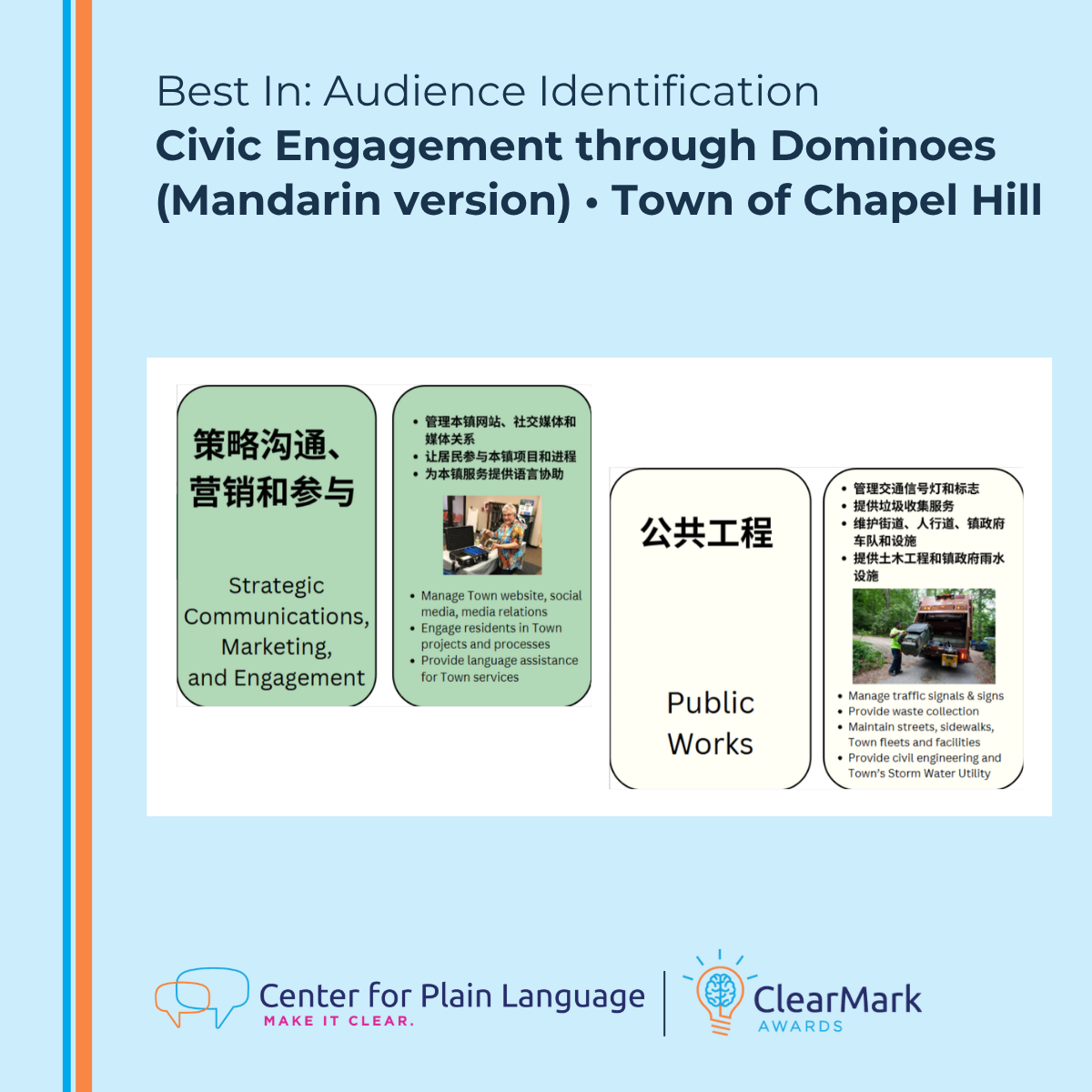
Audience Identification
Winner: Civic Engagement through Dominoes (Mandarin version) • Town of Chapel Hill
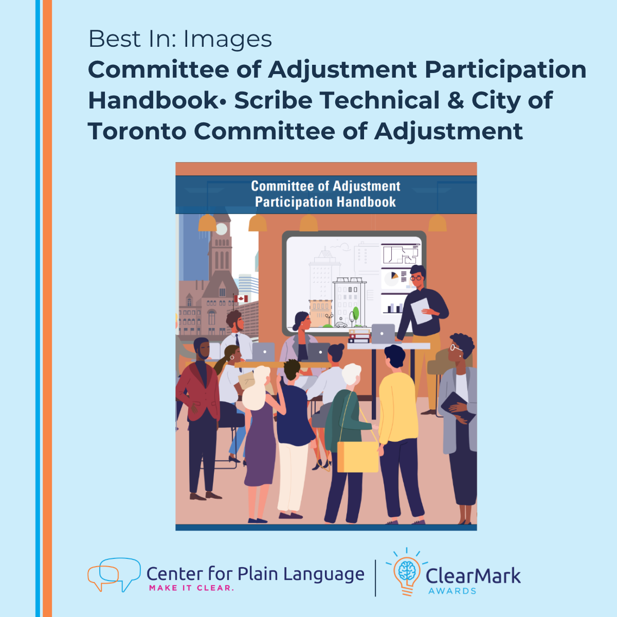
Images
Winner: Committee of Adjustment Participation Handbook • Scribe Technical & City of Toronto Committee of Adjustment
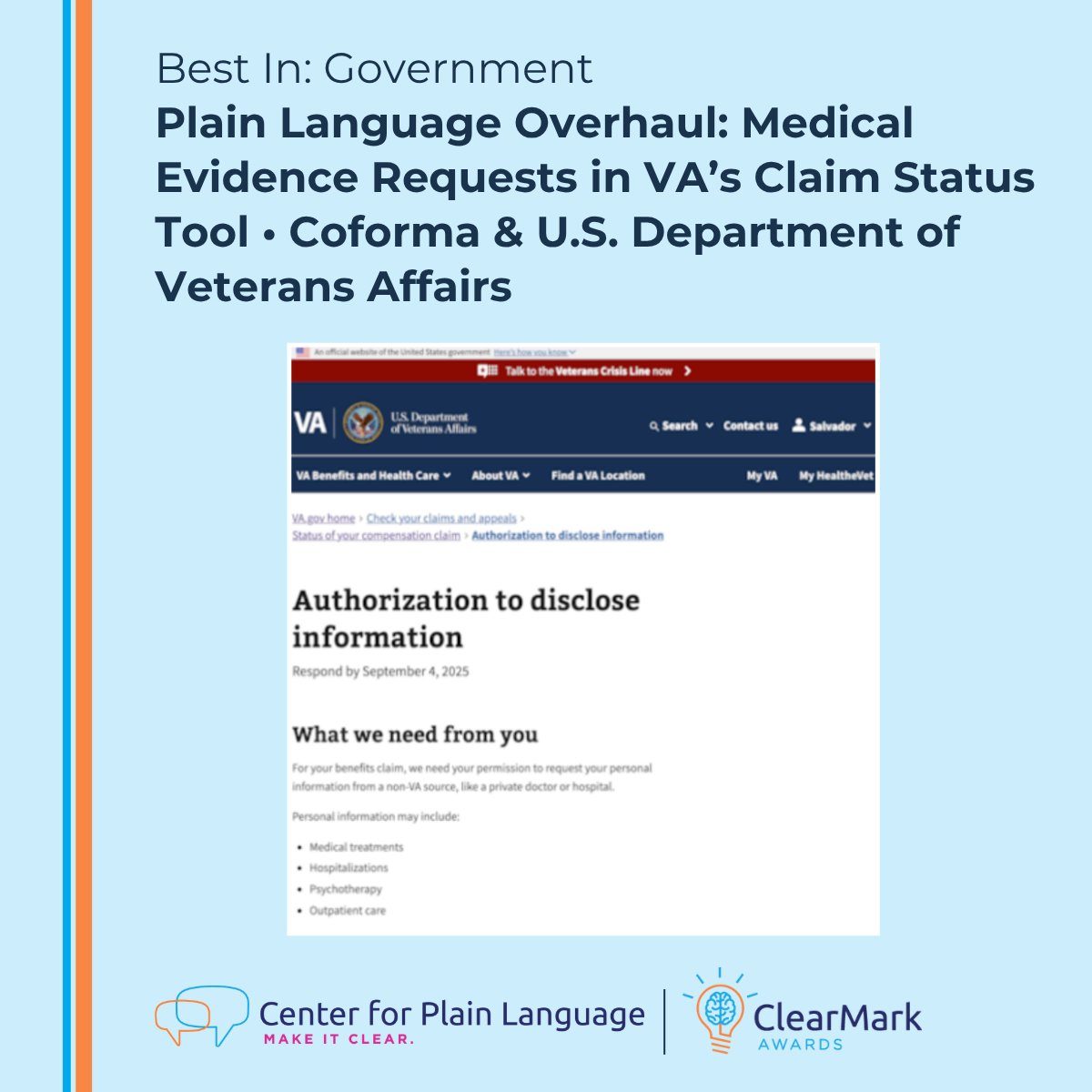
Government
Winner: Plain Language Overhaul: Medical Evidence Requests in VA’s Claim Status Tool • Coforma & U.S. Department of Veterans Affairs
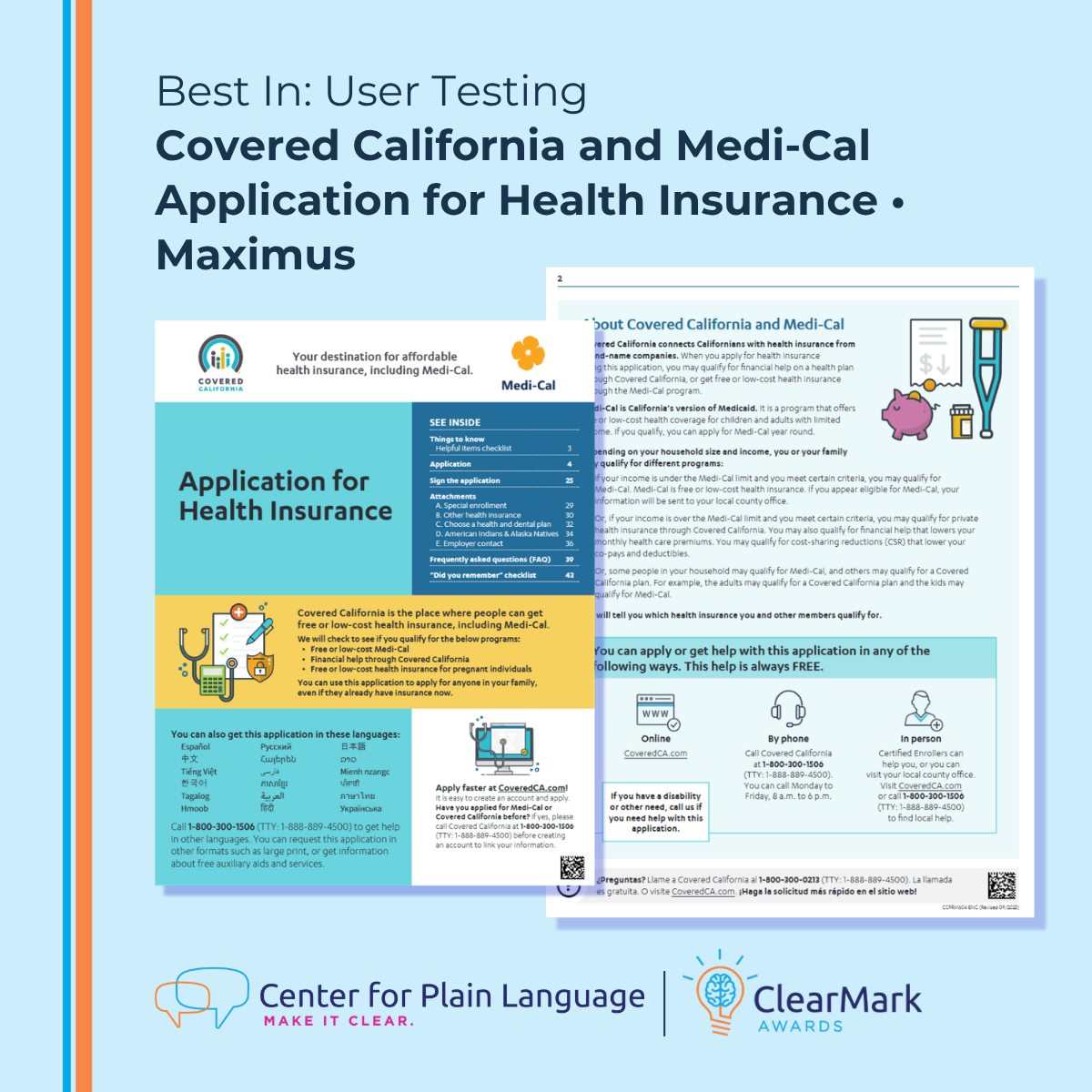
User Testing
Winner: Covered California and Medi-Cal Application for Health Insurance • Maximus
Clear communication improves outcomes. It helps people make informed decisions, access services, and take action with confidence.
We celebrate this year’s winners for setting a strong example and for showing how plain language makes a real difference.