 Plain language writers are mindful about displaying text in highly readable fonts. Some writers choose fonts based on aesthetic considerations; others follow common text display conventions.
Serif Fonts
Many American readers prefer serif fonts for printed materials and long texts. Serif fonts are thought to improve readability because they give you stylized anchors (ascenders and descenders) to guide your eye along each string of text. Serif fonts also approximate the letter shapes older Americans first learned in primary school, so they feel more familiar. Because of this, serif fonts can be easier to decode, increasing reading speed and comprehension.
Common serif fonts: Times, Times New Roman, Courier
Sans Serif Fonts
Others, especially younger Americans, prefer sans serif fonts. That’s probably because they have grown up in a digital world where sans serif fonts hold up best. This plainer type is also thought to hold up better to photocopying, scanning, and faxing as there are fewer type embellishments that could degrade.
Common sans serif fonts: Arial, Helvetica, Verdana
Roboto – Everybody’s next favorite font?
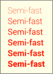
 A new Google font called Roboto combines some aspects of serif and sans serif fonts. Its open curves resemble sans serif styling, but the square dot and geometric flourishes on some letters are more like a serif font. Roboto’s noticeably embellished punctuation marks are thought to make it easier for software engineers to review code.
Have a look for yourself. If you like what you see, you can download a Roboto font set here.
 About the Author: Maria Mindlin is a linguist, former court interpreter, and founder of Transcend, a language services company in California. She loves teaching plain language and enjoys the challenge of translating inaccessible text into language most people can understand.
